CSS is the go-to approach for layout our web pages. Initially, we’ve used HTML tables, floats, and positioning for design the elements in our web pages. But problems arise when working with those methods. Then CSS flexbox comes to rescue, even though it has some limitations as well because it’s intended to provide more straightforward one-dimensional layouts, not complex two-dimensional layouts. In this article, I’ll show you guys the power of CSS Grid by creating a layout example.
CSS grid is the first CSS module created specifically for solving those complex layout problems. It’s a two-dimensional layout system with rows and columns. It uses to design grid-based user interfaces so that we don’t have to rely on floats and position anymore.
Table of Contents
Browser support
According to the caniuse web site, all the major web browser vendors support CSS grid. Below are the supporting browsers with the versioning numbers. The green colour is for supported version and the red colour is for unsupported versions.

Create a layout with main column and sidebar
It’s better to learn the CSS grid by an example rather than going to grid concepts directly. To kick off things, let’s start with a basic layout, which is very common you see in websites and web applications.
In your favourite text editor, create an html file and link the CSS file. All the CSS will be going into the style.css file.
<!DOCTYPE html>
<html lang="en">
<head>
    <meta charset="UTF-8">
    <meta name="viewport" content="width=device-width, initial-scale=1.0">
    <title>css-grid</title>
    <link rel="stylesheet" href="style.css">
</head>
<body>
    <div class="container">
        <div>Lorem ipsum dolor sit amet, consectetur adipisicing elit. Fuga, neque qui incidunt, blanditiis suscipit, voluptatum reprehenderit nulla assumenda eos minima facere ducimus? Assumenda quam eveniet quod nostrum odio perspiciatis officia, pariatur porro molestias consequatur obcaecati animi iusto magni est sit ex! Labore quibusdam dolorem ratione ipsam, aperiam minus vero! Ducimus doloremque alias amet rerum officia exercitationem non labore voluptatibus asperiores.</div>
        <div>Lorem ipsum dolor sit amet consectetur adipisicing elit. Ducimus, recusandae accusamus pariatur molestias aspernatur dolore quibusdam numquam quidem commodi tempora, magnam asperiores laudantium eum laborum mollitia? Molestias reprehenderit illum veniam qui repellendus ipsum atque! Repudiandae nulla nobis id exercitationem sapiente!</div>
    </div>
</body>
</html>
In the above HTML file, we have one main div with the container class. That will wrap our whole layout. Inside the container class, we have two divs. One for the main layout and another one for the sidebar. Also, I have put some dummy content in the above two divs.
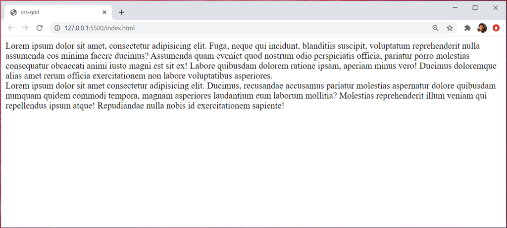
Before going into the grid layout, let’s add some CSS. So that we can better visualize the outlines of each divs.
.container > div {
    background-color: #eee;
    padding: 10px;
}

.container > div:nth-child(odd) {
    background-color: #ddd;
}
.container > div CSS rule will apply to every direct divs of container div. .container > div:nth-child(odd) will add different shades of grey colour to the other div elements.
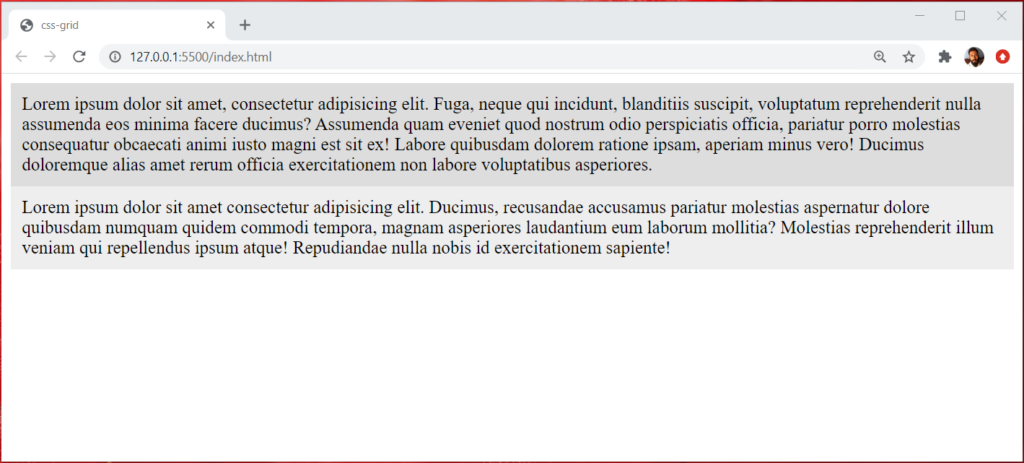
Adding grid rules
Let’s make our container class display the CSS rule as a grid. You will notice that it won’t change anything in our web layout. To make it happen, we have to provide grid-template-columns property.
I want to divide my layout as 80% for the main column and 20% for the sidebar column.
.container {
    display: grid;
    grid-template-columns: 80% 20%;
}
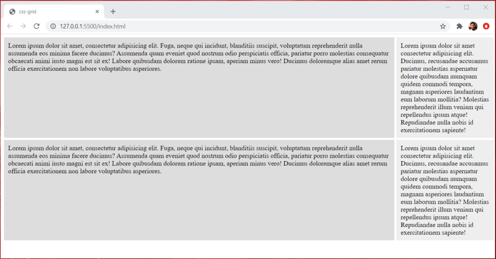
Then our web layout will look like below.
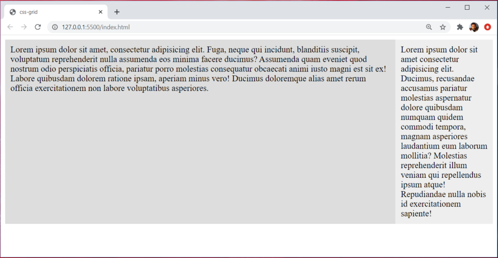
Since we declare our container class as a grid, no matter what amount of divs we put in the main container will conform to the values of grid-template-columns.
For example, let’s add two more divs to the container div.
<div class="container">
<div>Lorem ipsum dolor sit amet, consectetur adipisicing elit. Fuga, neque qui incidunt, blanditiis suscipit, voluptatum reprehenderit nulla assumenda eos minima facere ducimus? Assumenda quam eveniet quod nostrum odio perspiciatis officia, pariatur porro molestias consequatur obcaecati animi iusto magni est sit ex! Labore quibusdam dolorem ratione ipsam, aperiam minus vero! Ducimus doloremque alias amet rerum officia exercitationem non labore voluptatibus asperiores.</div>
<div>Lorem ipsum dolor sit amet consectetur adipisicing elit. Ducimus, recusandae accusamus pariatur molestias aspernatur dolore quibusdam numquam quidem commodi tempora, magnam asperiores laudantium eum laborum mollitia? Molestias reprehenderit illum veniam qui repellendus ipsum atque! Repudiandae nulla nobis id exercitationem sapiente!</div>
</div>Now let’s move to the browser, and we can see already defined CSS grid rules apply to our divs.
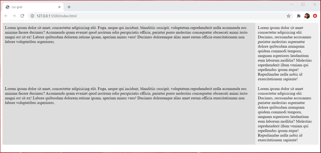
As you can see in the above output, everything looks tight. How about adding some space, so that layout will look better. Well, one thing you can do is add some margin. But with the CSS grid, you don’t need to add margins, adding grid specific rules will take care of us.
Let’s add some space between columns.
.container {
    grid-column-gap: 5px;
}
Also, add some space between rows as well.
.container {
    grid-row-gap: 5px;
}
Now those changes will be visible in the browser.
Note: we can replace grid-column-gap and grid-row-gap with grid-gap CSS property.
Grid-template-columns/ Grid-template-rows
Once we set our HTML element in a grid context using display: grid, above those two properties, are the primary CSS properties for establishing a grid layout.
Specifying grid column sizes
Provided value could be percentages, fractions (fr), auto, min-content, max-content, and minmax(), or the repeat() function.
Let’s utilize fractions values in this example.
I have created an HTML file with six div and put dummy content inside those divs.
<div class="container">
    <div>Lorem ipsum dolor sit amet consectetur.</div>
    <div>Lorem ipsum dolor sit amet consectetur.</div>
    <div>Lorem ipsum dolor sit amet consectetur.</div>
    <div>Lorem ipsum dolor sit amet consectetur.</div>
    <div>Lorem ipsum dolor sit amet consectetur.</div>
    <div>Lorem ipsum dolor sit amet consectetur.</div>
</div>
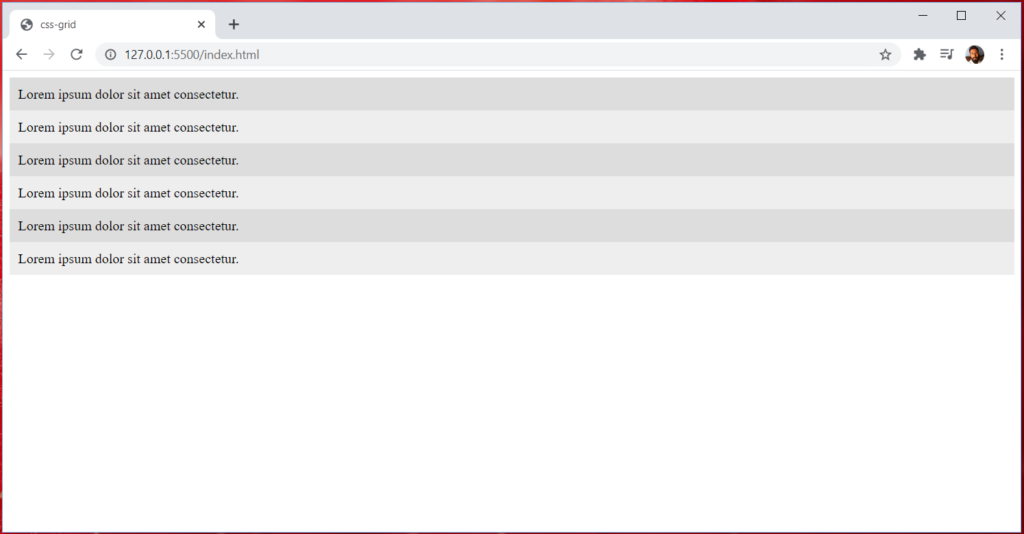
Without grid CSS, HTML output would look like below.
Let’s add the grid context and grid-template-columns CSS properties.
.container {
    display: grid;
    grid-template-columns: 1fr 1fr 1fr;
    grid-gap: 10px;
}
According to the above CSS rules, we should have three columns with equal fractions.

Note: instead of defining each fraction multiple times, we can use the repeat() function. Above grid-template-columns: 1fr 1fr 1fr can be replaced as repeat(3, 1fr).
grid-auto-rows
grid-auto-rows css property specifies the size of a grid row. Values of grid-auto-rows can be keyword (min-content, max-content, auto), length value (100px), percentage value (10%), flexible value (2fr), and minmax() function value.
If our rows height or size need to be flexible, a better choice would be to choose the minmax() function.
.container {
    display: grid;
    grid-template-columns: repeat(3, 1fr);
    grid-gap: 10px;
    /* grid-auto-rows: 100px; */
    grid-auto-rows: minmax(100px, auto);
}
minmax(100px, auto) means the minimum height of the row should be 100px. If content inside that row goes beyond 100px then the row should be adjusted automatically to fit the content. So that content won’t overflow outside the row div.

Nesting Grids
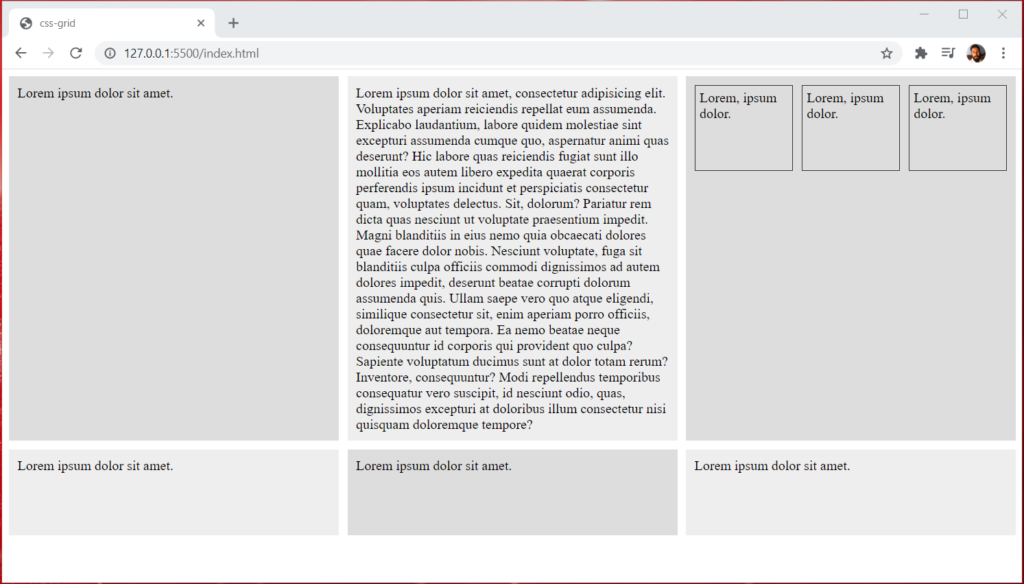
A nested grid means a grid within another grid. Let’s add three divs inside the main div and add a class to the main div.
<div class="container">
    <div>Lorem ipsum dolor sit amet.</div>
    <div>Lorem ipsum dolor sit amet, consectetur adipisicing elit. Voluptates aperiam reiciendis repellat eum assumenda. Explicabo laudantium, labore quidem molestiae sint excepturi assumenda cumque quo, aspernatur animi quas deserunt? Hic labore quas reiciendis fugiat sunt illo mollitia eos autem libero expedita quaerat corporis perferendis ipsum incidunt et perspiciatis consectetur quam, voluptates delectus. Sit, dolorum? Pariatur rem dicta quas nesciunt ut voluptate praesentium impedit. Magni blanditiis in eius nemo quia obcaecati dolores quae facere dolor nobis. Nesciunt voluptate, fuga sit blanditiis culpa officiis commodi dignissimos ad autem dolores impedit, deserunt beatae corrupti dolorum assumenda quis. Ullam saepe vero quo atque eligendi, similique consectetur sit, enim aperiam porro officiis, doloremque aut tempora. Ea nemo beatae neque consequuntur id corporis qui provident quo culpa? Sapiente voluptatum ducimus sunt at dolor totam rerum? Inventore, consequuntur? Modi repellendus temporibus consequatur vero suscipit, id nesciunt odio, quas, dignissimos excepturi at doloribus illum consectetur nisi quisquam doloremque tempore?</div>
    <div class="nested">
        <div>Lorem, ipsum dolor.</div>
        <div>Lorem, ipsum dolor.</div>
        <div>Lorem, ipsum dolor.</div>
    </div>
    <div>Lorem ipsum dolor sit amet.</div>
    <div>Lorem ipsum dolor sit amet.</div>
    <div>Lorem ipsum dolor sit amet.</div>
</div>
Then add CSS display: grid property to the main div of the class nested. Also, add the grid-template-columns, height for the rows, and some gap between each div using the grid-gap property.
For better visualization, I have added border and padding CSS rules for each div in the nested class.
.nested {
    display: grid;
    grid-template-columns: repeat(3, 1fr);
    grid-auto-rows: 100px;
    grid-gap: 10px;
}

.nested > div {
    border: 1px solid #333;
    padding: 5px;
}
Let see the output of the nested grid.
Justifying and Align items
With CSS grid layout, the grid items and grid itself within its container can position with the following six properties. justify-items, justify-content, justify-self, align-items, align-content, align-self.
Let’s add four divs inside the main div and add container class to the main div.
<div class="container">
    <div class="square">square 1</div>
    <div class="square">square 2</div>
    <div class="square">square 3</div>
    <div class="square">square 4</div>
</div>
Inside each div of the container class, I have added a class of square.
Let’s add grid context to the container class and some grid properties to set the row height and column gap.
.container {
    display: grid;
    grid-template-columns: 1fr 2fr 1fr;
    grid-auto-rows: minmax(100px, auto);
    grid-gap: 10px;
}
Below is the output of the above CSS rules.

justify-items
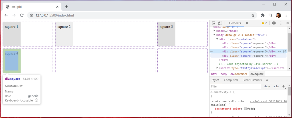
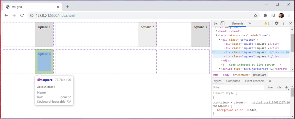
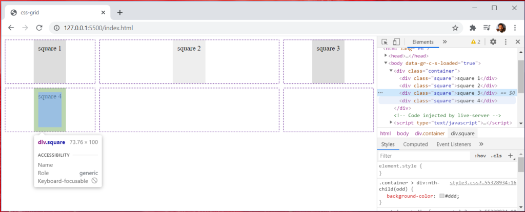
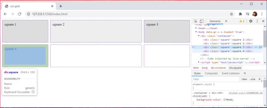
Let’s say I want to justify my content on the x-axis (row axis). It will put the items at the start, end, center, or stretch the whole row to fill the content.
Below are the outputs of start, end, center, and stretch values.
justify-items: start
add above CSS rule to the container class.
justify-items: end
justify-items: center
justify-items: stretch
Align-items
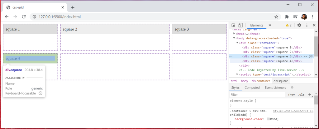
Similar to justify-items, but align the grid items along the columns axis (y-axis). It has the values of start, end, center, and stretch.
Below are the outputs of start, end, center, and stretch values.
align-items: start
add above CSS rule to the container class. For the simplification, I have removed the justify-items CSS property from the container class.
align-items: end
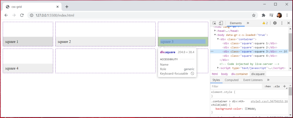
align-items: center
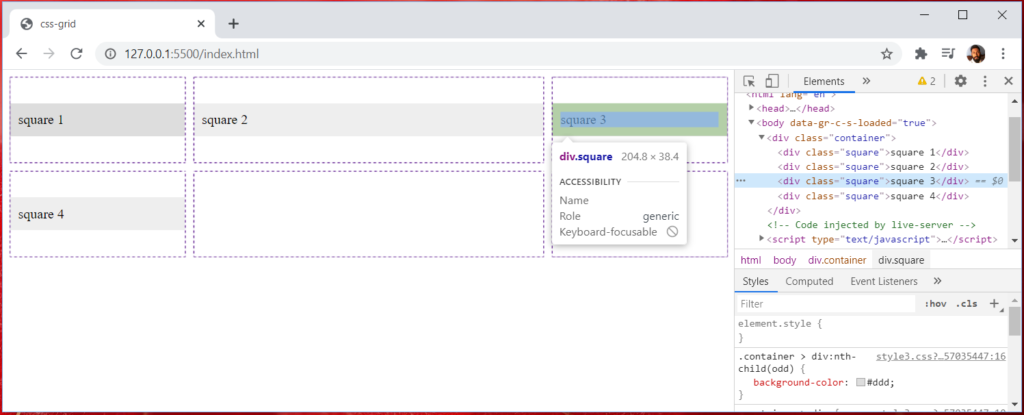
align-items: stretch

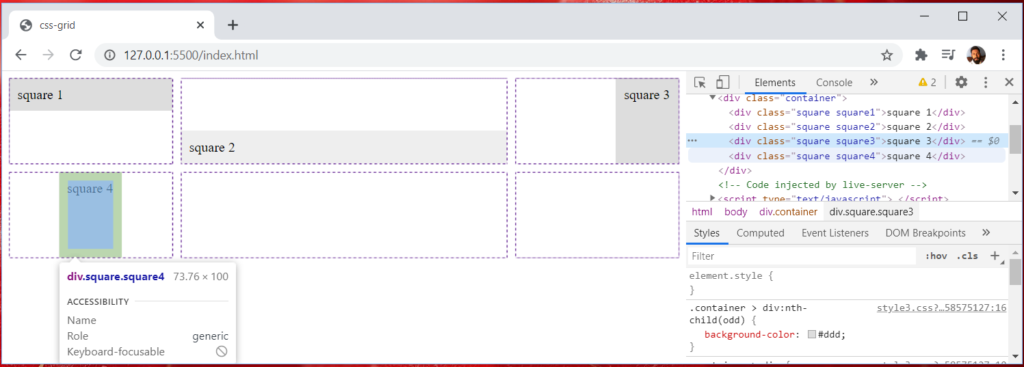
Above justify-items and align-items will apply to all divs inside the container. What about if we want to manipulate a single div. For that, we have justify-self and align-self.
Let’s add individual classes for each div inside the main container class.
<div class="container">
    <div class="square square1">square 1</div>
    <div class="square square2">square 2</div>
    <div class="square square3">square 3</div>
    <div class="square square4">square 4</div>
</div>
Let’s see the example for start, end, center, and stretch values with align-self and justify-self for each div.
.container {
    display: grid;
    grid-template-columns: 1fr 2fr 1fr;
    grid-auto-rows: minmax(100px, auto);
    grid-gap: 10px;
}

.square1 {
    align-self: start;
}

.square2 {
    align-self: end;
}

.square3 {
    justify-self: end;
}

.square4 {
    justify-self: center;
}
Below is the output of the above CSS properties.
Conclusion
In this short tutorial, we have looked into some basic concepts of CSS grid layout and learn CSS Grid by an Example. You can leverage CSS grid layout for web layout design without using third party CSS frameworks such as bootstrap, foundation, etc. I think that web interfaces will mostly be created using a grid layout system because it is such a powerful addition to the CSS world. you can find some good examples and detailed explanations for each concept form this website.
I have been using bootstrap grid for a long time this article makes me wanna try css grid . Thank you so much for sharing 🙂
Yes, we can replace bootstrap with new CSS Grid layout.